
Creating FLOWER HUB NWI's Logo:
1. I asked the client to answer a few questions regarding the brand. Here are some things she highlighted regarding her vision for the logo.
"A flower is not a bad thing, but I am tired of daisies, roses and sunflowers. I'd like to get the idea of community across in some way."
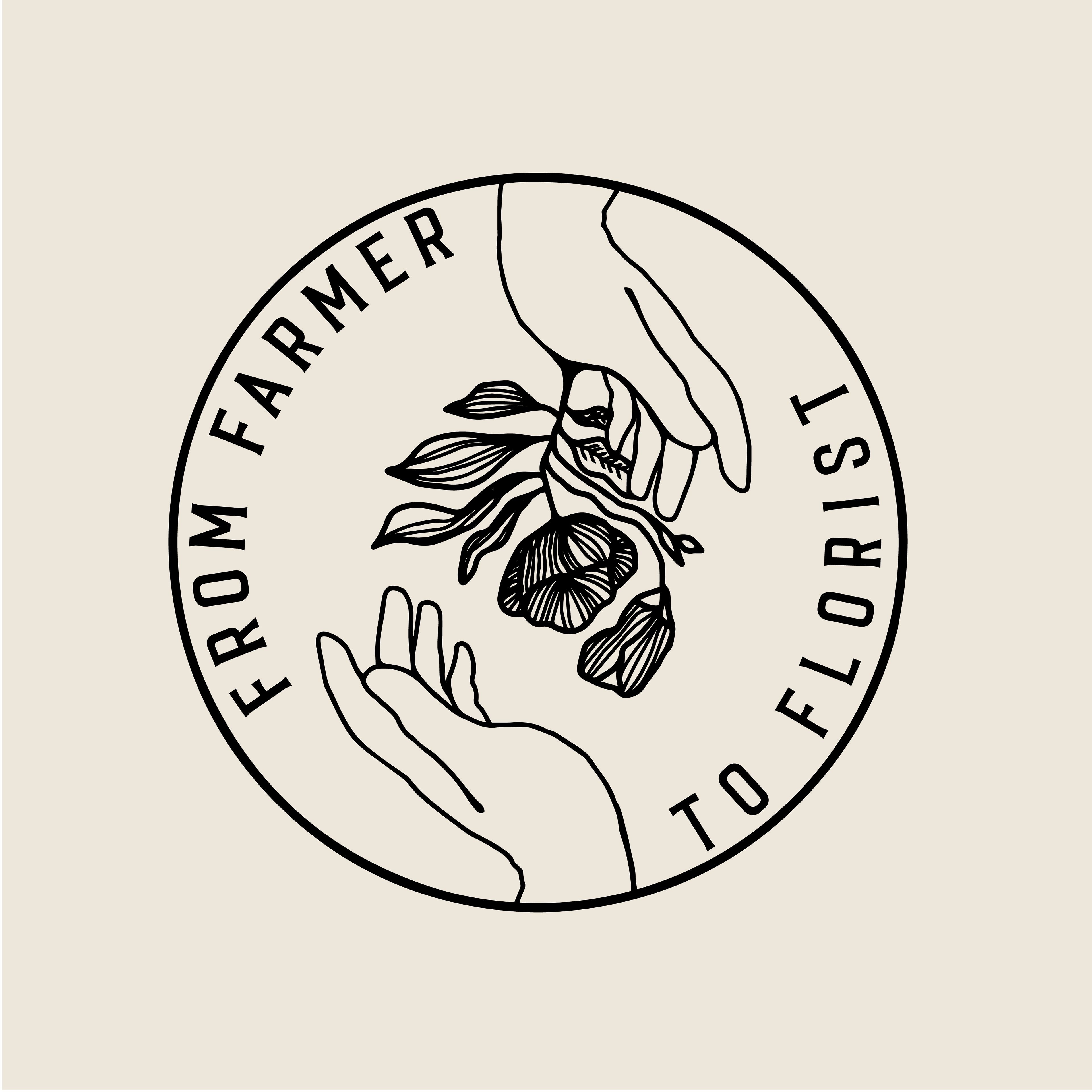
2. With her input I made sure to keep in mind the concept of community, the idea of farmer to florist and came up with the simple slogan "From Farmer to Florist" and did some brainstorming and sketches late into the night.
3. Over the next few days I was able to finalize an image of a farmer's hand offering a flower to the florist down below. The concept is related to community and unity with the circle encapsulating the image and the flower is rooted into the farmer's hand to show the earthiness and labor related to the job. In some way the hands are connected as the flower will fall without the florist to catch it, thus showing their connection, from farmer to florist.
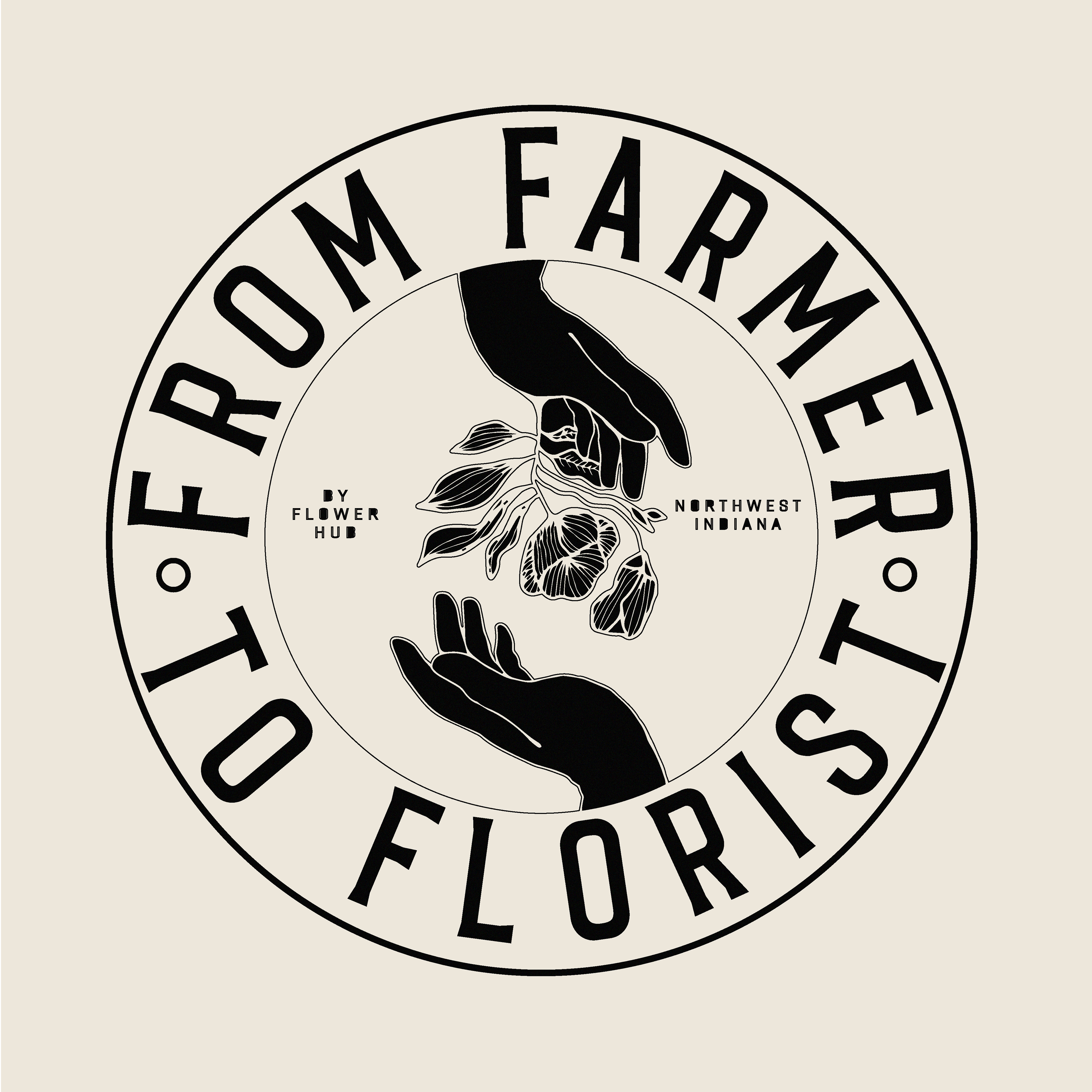
4. I sent over the logo with multiple variations of the typeface in different directions and the image as well.
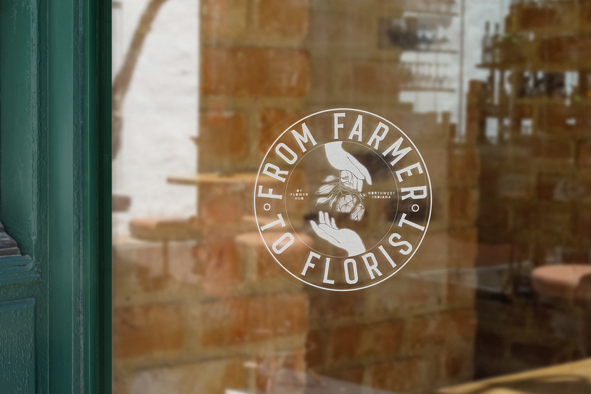
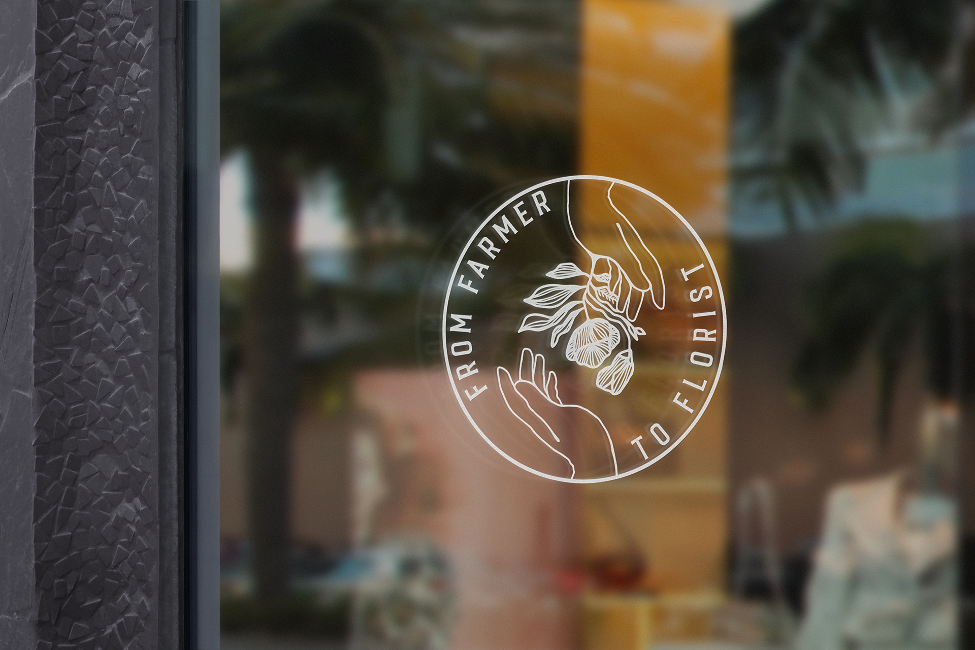
5. The client was satisfied with the final logo after delivery and didn't ask for any modifications.